
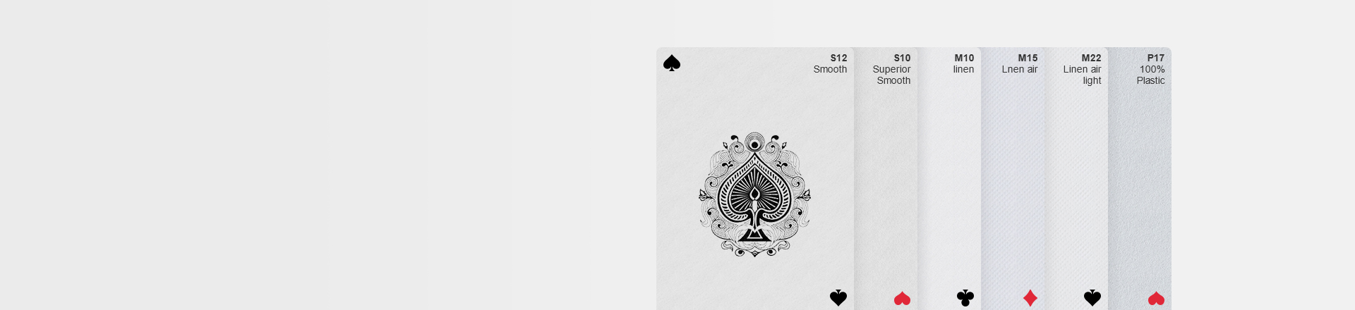
Why You Need to Choose a Good Font for Your Game Cards
When it comes to designing game cards, every detail counts. The choice of font might seem like a small decision, but in the world of gaming, it's akin to selecting the right seasoning for a gourmet dish. The font you choose can elevate your game, making it an engaging experience, or it can drag it down, leaving players squinting in frustration. Let's explore why selecting the right font is crucial, look at some of the most common fonts used in game cards, their advantages, and where you can find them.
Why You Need to Choose a Good Font for Your Game Cards?
The Role of Fonts in Game Design
Fonts are the voice of your game. They convey mood, personality, and clarity, much like how a narrator sets the tone in a story. Imagine reading a fantasy novel with modern sans-serif fonts sprinkled throughout the pages. It would feel out of place, disjointed, and distracting. The same goes for game cards. Whether your game is a whimsical adventure, a gritty strategy battle, or a lighthearted party game, the font must align with the theme and enhance the experience.
Enhancing Readability and Engagement
The primary function of a font is to communicate information clearly. This is especially important in games where players often need to read and understand text quickly. A well-chosen font ensures that players can effortlessly absorb the content, keeping the game's momentum flowing smoothly. On the other hand, a poorly chosen font can cause confusion, slow down gameplay, and even lead to misinterpretation of rules or card abilities.
Think of a font as the bridge between the game's visual design and the player's understanding. If the bridge is well-constructed, players can easily traverse it; if it's shaky or full of holes, players will struggle to cross, and their enjoyment of the game will falter.
Setting the Mood and Tone
Fonts do more than just deliver text; they set the mood. For instance, a horror-themed game might use a font with jagged edges and an eerie vibe to enhance the atmosphere of dread and suspense. In contrast, a playful, family-friendly game would benefit from a rounded, bubbly font that exudes warmth and fun.
Consider the difference between using a font like Creepy for a dark, mysterious game and Comic Sans for a casual, humorous game. Each choice sends a different message to the players before they even start reading the text, anchoring them in the game's world.
Common Fonts for Game Cards and Their Advantages
There's a wide array of fonts available for game designers, each with its own unique flair and functionality. Let's dive into some of the most commonly used fonts in the world of game cards, their advantages, and examples of games that utilize them effectively.
1. Serif Fonts: Tradition and Authority
Times New Roman and Garamond are classic serif fonts that bring a sense of tradition and authority to the table. These fonts are characterized by the small lines, or serifs, at the ends of each letter, which guide the reader's eyes from one letter to the next. This makes them ideal for games with a historical or fantasy setting, where immersion in a detailed, expansive world is key.
Example: Many traditional card games, such as bridge or poker, often use serif fonts for their instruction manuals and even on some cards to convey a sense of timeless elegance.
Where to Find Them: Serif fonts like Times New Roman are widely available on most word processing software. For more unique or customized serif options, Google Fonts offers a variety of free downloadable fonts.
2. Sans-Serif Fonts: Modern and Clean
Arial and Helvetica are popular sans-serif fonts, known for their clean, modern look. Sans-serif fonts lack the small lines at the ends of letters, resulting in a more streamlined appearance. These fonts are highly readable, making them a favorite for games that require quick, clear communication, such as strategy games or educational cards.
Example: The popular board game Pandemic uses a sans-serif font for its text, contributing to the game's crisp, clinical feel—perfect for a game about combating global diseases.
Where to Find Them: Sans-serif fonts are abundant and can be found in any design software. Google Fonts and Adobe Fonts both offer extensive libraries of sans-serif options.
3. Script Fonts: Elegance and Flourish
Script fonts, such as Brush Script or Lobster, mimic the fluidity of cursive handwriting. They are ideal for games that want to convey elegance, romance, or an old-world charm. These fonts, however, should be used sparingly, as they can be harder to read in large blocks of text.
Example: The game Love Letter uses a script font to enhance its romantic theme, giving the cards a sense of intimacy and personal touch.
Where to Find Them: Script fonts can be found on various font websites, including Google Fonts, which offers both free and open-source script fonts.

4. Display Fonts: Unique and Thematic
Display fonts are designed to grab attention and are often used for titles or key phrases on cards. Fonts like Impact or Bangers fall into this category, characterized by bold, eye-catching designs. These are perfect for games with strong thematic elements that need to stand out.
Example: Munchkin, a humorous role-playing card game, uses a distinctive display font that adds to its quirky, over-the-top style.
Where to Find Them: Display fonts are readily available on platforms like DaFont, which hosts a wide range of creative, free fonts designed for impact.
Where to Find Fonts for Your Game Cards
The digital world is brimming with resources where you can find the perfect font for your game cards. Whether you're looking for something traditional, modern, or entirely unique, there are several go-to sources:
1. Google Fonts: A free and extensive library of fonts, Google Fonts is a great starting point for both web and print design. It offers a wide variety of styles and is easy to navigate.
2. Adobe Fonts: Formerly known as Typekit, Adobe Fonts offers a vast collection of fonts, included with Adobe Creative Cloud subscriptions. The fonts are high quality, and the integration with Adobe software makes it a convenient choice for designers.
3. DaFont: Known for its eclectic and diverse range of fonts, DaFont is a popular site for finding display and decorative fonts. Many of the fonts are free for personal use, with licensing available for commercial projects.
4. Fontsquirrel: This site offers a curated selection of high-quality fonts, many of which are free for commercial use. Fontsquirrel also has a handy tool for identifying fonts from images, which can be useful if you're looking to match a specific style.
Font for Your Game Cards Conclusion
Choosing the right font for your game cards is not just about aesthetics—it's about creating an immersive, enjoyable experience for your players. A well-chosen font enhances readability, sets the tone, and reinforces the game's theme, much like how the right background music can transform a movie scene from mundane to magical. By taking the time to explore different fonts and their characteristics, you can ensure that your game speaks to players in the clearest, most engaging way possible.
So, whether you're designing a card game set in a medieval fantasy world or a modern-day strategy challenge, remember that the font you choose is more than just letters on a page—it's the voice of your game.
As a full-service online printing company, Acelion is proud to offer customers a built-in online designer where you can create your own print designs. You have access to a wide variety of commercially usable templates and elements, such as fonts, backgrounds, and more—all at no extra cost! To start designing your own printed products using these fonts, simply visit our website and select a product to get started.
Relevant
- Blog
- Creative Ideas for Artist Trading Cards: 30 Unique Inspirations
- Specialty Paper Guide: 4 Powerful & Stunning Types That Impress
- Top 20 Modern Card Deck Ideas To Strong Custom Printing
- Online Card Maker: 5 Powerful Free vs Paid Features to Save Big
- 20 Creative Board Game Ideas to Spark Fun & Learning
- 5 Environmentally Friendly Game Card Packaging Solutions
- A History of the Tarot: From Card Game to Cosmic Symbolism
- Creative Playing Cards: 5 Bold Design Inspirations
- How Custom Corporate Cards Enhance Branding and How They Are Made
- Why And How To Design Your Own Flashcards?
- The Magnetic Charm of Cardistry: A Modern Art Form's Enduring Appeal
- 290gsm Italian Black Core Vs 300gsm Japan Black Core: A Deep Dive into Premium Playing Card Materials
- The Art Of Shine: A Complete Guide To Foil Printing In Playing Card Design
- Remembering Complex Tarot Spreads With Custom Instruction Booklets
- Packaging For Your Playing Card Box: Shrink Wrap vs. Cello Wrap
- Modern Innovations In Playing Card Design: A New Era Of Creativity And Functionality
- The Spade Symbol: The Origins And Inspirations Behind Playing Card Design 1
- The Ultimate Color Psychology Guide to Print Promotional Playing Cards 2
- Choosing the Best Online Playing Card Printer
- 10 Innovative Tips For Crafting Effective Marketing Playing Cards
- Use Canva To Create Print-Ready Playing Card Files
- Online Card Printing Checklists: Mastering Print Perfection
- Advertising Playing Cards Myths: Use Them To Maximize Your Business Growth
- How To Choose An Online Custom Playing Card Website 1?
- The Booming World Of Custom Card Game Market
- Waterproof Elements: A Dive into Plastic Playing Cards
- How to Customize Playing Cards: Interview From The Card Designer
- Playing Card Deck Printing for Prototypes and Limited Editions
- Playing Card Size: Design Overview And Guide
- Dealing Up Fun: A Guide to Card Games for Kids
- Dealing Up Fun: A Guide to Card Games for Adults
- How To Make Playing Cards #3: Specifications To Print Playing Cards
- How To Make Playing Cards #2: Elements About Designing Playing Cards
- How To Make Playing Cards #1: Techniques To Design Playing Cards
- Coolest Playing Card Designs That Cut a Figure In 2024
- How To Design For Tarot Brands And Astrology Tarot Cards
- Tarot Color Symbols: 12 Important Colors In Tarot Cards
- Card Game Design: 4 Playing Card Design Ideas
- The Hidden Worlds: A Journey Through Tarot Card Back Designs
- A Shuffle Through 2024: Popular Playing Card Designs
- How To Design And Make a Window Tuck Box For Playing Cards?
- Playing Cards Drawing Ideas And Design Inspiration
- From Paper To Plastic: What Are Playing Cards Made Of?
- How To Make Flashcards: A Comprehensive Guide For Effective Flashcards
- How To Make Tarot Cards Out Of Playing Cards?
- Create Any Design And Make Playing Cards At Acelion Playingcards
- How To Play Poker For Beginners 1: Hearts And Spades Card Game
- How To Play Poker For Beginners 2: Speed And War Card Game
- Designs Of Playing Card Suits: A Dive Into The Markings Of A Deck
- Color Psychology in Playing Card Design: Beyond Red and Black
- Number Typography and Readability For Playing Cards Design
- 10 Card Game Design Blogs And Websites To Explore
- Understanding Tarot Card Designs: Core Principles and Significance
- Card Deck Design: Customization and Personalization
- Custom Playing Cards: Regional Variations In Playing Card Design
- Finding Your Ideal Tarot Card Manufacturer: A Step-by-Step Guide
- POD Compliance and Legal Considerations For Trading Card Game
- April Fool's Day and the Fool Tarot Card: A Curious Juxtaposition
- Face Cards Evolution 1: The Design Journey of Playing Card Courts
- Face Cards Evolution 2: The Design Journey of Playing Card Courts
- Hierarchy Of Poker: A Guide To Poker Hand Rankings
- Printing Services vs. DIY Printing: The Great Debate For Custom Playing Cards
- Printer Compatibility: Laser, Inkjet Or Offset For Playing Cards Printing?
- Playing Card Packaging Options: Protect and Present Your Decks in Style
- Tarot Printing: Choosing High-Quality Images
- The Role of Technology in Creating Custom Game Cards
- How To Choose An Online Custom Playing Card Website 2?
- Creative And Fun Uses For Trading Cards: Beyond The Basics
- Why And How To Fully Custom Game Cards Both Sides?
- Why And How To Fully Custom Game Cards Both Sides?
- Playing Card Printing: Equipment, Setup, and Troubleshooting
- The Ultimate Guide To Black Core Cardstock: Durability, Options, And Iconic Decks
- The Ins and Outs of Custom Playing Card Materials and Finishes
- 5 Money-Saving Tips (With Custom Cards) For Small Businesses
- The Art of Special Finishes: Elevating Custom Cards with Unique Touches
- 6 Essential Considerations When Selecting the Ideal Online Card Printer
- Copyright Guidelines for Game Card Designers
- Discover The Advantages Of Printing Cards With AcelionPlayingCards.Com
- Why You Need to Choose a Good Font for Your Game Cards
- The Ultimate Color Psychology Guide to Print Promotional Playing Cards 1
- 10 Essential Factors To Consider When Designing High-Quality Playing Cards
- Mastering Spades Playing Cards: The Most Popular Questions Answered
- How Many Cards Should You Design For Custom Card Decks?
- The Best Teacher Gifts for Anytime of Year: Flash Cards and Board Games
- Playing Cards: Icons Of Pop Culture And Their Fascinating Journey
- The 5 Benefits of Playing with Custom Game Cards
- Educational Benefits of Custom Memory Game Cards: Enhancing Cognitive Development Across Age Groups
- Debunking 6 Tarot Card Myths And Beginner Tips For Tapping Into Your Intuition
- Print-Ready Tarot File: Enlarge the Image
- Top 7 Most Discussed Topics By Playing Card Creators
- 5 Steps To Craft A Hit Card Game
- Managing Dies for Card Printing Precision: A Masterclass in Craftsmanship
- The Timeless Deck: Rediscovering the Relevance of Paper Playing Cards in the Digital Age
- The Spade Symbol: Unraveling the Origins and Inspirations Behind Playing Card Design 2
- Cardstock Options For Custom Playing Cards: An Order Guide
- The Uses of Playing Cards: A Journey Through History and Versatility
- How To Solve Difficulty In Shuffling With The Right Playing Cardstock And Finishes?
- Acelion Playing Card's Environmental Commitment: For a Greener Tomorrow
- Why Choose China For Custom Card Printing From Acelion’s Insights
- Use Jumbo Playing Cards To Solve Difficulty In Playing With Large Groups
- What Caused The Explosion In Custom Tarot Decks?
- Design Wedding Playing Cards as Unique Guest Gifts with POD Services
- 10 Creative Playing Card Inspirations That Will Blow Your Mind
- Effortless Custom Corporate Playing Cards: 1 Design & Production Guide
- Wedding Playing Cards: 54 Romantic Ways to Tell Your Love Story
- Wedding Poker Cards: 10 Stunning Theme Design Ideas
- Custom Corporate Playing Cards: Amazing Boost in 2025
- Wedding Poker: Unlock 5 Powerful Customization Trends
- Custom Corporate Poker: 7 Stunning Ideas to Amplify Branding
- Online Card Maker: 5 Powerful Ways to Boost Holiday Sales
- Online Card Maker Trends 2025: Bold AI & AR Innovations
- Creative Poker Ideas: 5 Stunning, Happy Custom Gift Decks
- Custom Playing Cards: 5 Successful Industries That Thrive
- DIY Game Cards: 5 Exciting Ways Online Tools Transform Creativity
- Custom Poker Cards: 5 Powerful Ways to Boost ROI & Brand Love
- Custom Wedding Playing Cards: 10 Fun, Engaging Games for Epic Joy
- 20 Creative Wedding Favor Ideas Your Guests Will Love
- 18 Creative Corporate Promotion Ideas to Boost Your Brand
- Meeting Minimum Order Quantities: A Solution for Independent Artists and Small Businesses
- How to Publish Your First Tarot Deck: A Step-by-Step Guide for Creators
- How to Manage Your Game Card Printing Design: A Comprehensive Guide
- 5 Tarot Books You Should Read In 2025
- Cardstock Options For Custom Playing Cards: An Order Guide
- The Art Of Deception: The Magic Of Playing Cards In Cinema
- POD Playing Cards Trends in 2025: Print & Design Insights
- Why Is Playing Cards Important?
- 7 Experiences in Designing Game Cards: A Game Designer’s Journey
- 10 Unique Oracle Decks You Can Create for Spiritual Growth and Inspiration
- The Magic of Customization: Why Personalized Game Cards Outshine the Rest
- Card Game Accessibility and Customization: Making Games Welcoming and Personal
- 10 Ways Publishers Can Support Their Playing Card Decks
- The Cost of Playing Card Printing: Why Metallic Stamping Is So Expansive?
- Narrative Game Card Design: Weaving Stories Through Cards
- Engaging Flashcard Designs: Fun Ideas and Customizable Templates
- Science-Based Flashcard Design: Proven Techniques for Maximum Retention and Learning
- 15 Creative Uno Customizable Cards Ideas for Fun Gameplay
- Custom Quote Cards: 5 Stunning Ways to Inspire Your Next Project
- Custom Quote Card Ideas: 10 Creative Designs for Any Occasion
- Make the Playing Cards Near Me in USA: 10 Best Picks You’ll Love!
- 20 Inspirational Quotes for Printable Quotes Cards
- DIY Playing Cards: 52 Bold Ways to Tell Epic Brand Stories
- Make the Playing Cards Near Me UK – 10 Powerful Options Reviewed
- Positive Quotes Card Printing: 15 Strong Inspires with Custom Designs
- Life Quotes Card Printing: 20 Inspiring Designs to Elevate Joy
- Success Quotes Card Printing: 7 Inspiring Designs to Empower You
- Ace of Spades Card: 5 Powerful Reasons It Still Dominates
- How to Play Dominoes: 7 Brilliant Tips to Instantly Win More Games
- Quote Of The Day For Work Card Printing: 10 Powerful Ideas
- Playing Cards on Demand: 7 Powerful Reasons Creators Love Acelion
- Cute Quotes Card Printing: 12 Powerful Phrases to Boost Sales
- Fathers Day Card Idea: 20 Powerful & Heartwarming Designs
- Mothers Day Card Ideas: 20 Heartfelt & Powerful Gift Picks
- Aesthetic Quotes: 12 Stunning Ideas for Powerful Card Printing
- Print on Demand Tarot Cards: 7 Powerful Reasons to Start from Acelion
- Birthday Card Ideas: 13 Brilliant Ways to Create Unforgettable Joy
- 15 Valentines Day Card Ideas That Truly Wow & Inspire
- Make the Playing Cards Near Me in Japan: 10 Best Powerful Picks
- Online Card Maker: 7 Powerful Tips to Avoid Costly Mistakes
- Online Card Maker: 7 Powerful Benefits for Small Biz Success
- Creative Playing Cards: 7 Powerful Reasons Collectors Love Them
- Personalized Deck of Cards: 10 Powerful Reasons to Love It
- Eco Card Printing: 7 Powerful Reasons to Go Gree
- Gloss vs Matte: 7 Powerful Reasons to Choose the Right Finish
- POD Playing Cards: 5 Powerful Answers to Avoid Costly Mistakes
- Symbolism of Cardology: 10 Powerful Secrets You Should Know
- Customize Luxurious Playing Cards: 6 Powerful Reasons Why You Should Try
- Custom Card Games: 10 Powerful Ways for Positive Success
- Thank You Card Ideas: 5 Powerful Creative Tips That Inspire
- Poker Anti-Counterfeiting: 5 Powerful Ways to Avoid Fake Cards
- Sustainable Game Cards: 7 Powerful Benefits You Should Know
- Custom TCG: 8 Powerful Reasons for Massive Success
- Playing Card Back Design: 6 Powerful Tips for Stunning Success
- Trading Card Copyright: 8 Shocking Risks & Powerful Tips
- Creative Poker Gameplay: 7 Exciting Powerful Ideas
- Our Company
- Blog
- Help Center
- Privacy Policy
- Contact Us
- Terms & Conditions
- Return Policy & Guarantees
- About Us
- Online Design
- Custom Playing Cards
- Custom Game Cards
- Custom Flash Cards
- Custom Tarot Cards
- Custom Oracle Cards
- Custom Box Packages
- Custom Booklets
- Black Core Cards
- Your Account
- My Account
- Order Center
- My Programme
- My Cart
- Subscribe To Us
- Enter your email address to stay
- updated with us and receive
- exclusive member-only offers!
- SUBSCRIBE NOW AND GET 5% OFF


